Your website could be driving customers away - here’s why
Your business website exists to generate traffic and convert visitors to buyers. A well designed and well thought out website will demand the attention of its users. It will answer questions, highlight important information, generate trust, and transform the users to loyal, long term customers or clients.
With so many businesses online today, getting people to click across to your website should be seen as a victory. But if you are struggling to retain them, it’s time to think about why. If your website contains any of these annoying or off putting elements, you could be driving potential clients, and revenue, right out the door.

1. Your overall design is poor, and your website is slow
The last thing you want is for a potential customer to feel frustrated and annoyed when visiting your site because they have difficulty navigating your webpage or finding the information they need. Users will always remember their experience if it was a poor one, so it’s important to consider your navigation, site layout, design, and page load speed.
Viewers have become conditioned to expect instantaneous loading of their favourite websites, social media platforms, and videos. As a result, their attention span is shrinking, and most are unwilling to wait more than a few seconds for a website to load. In fact, studies show that for every 1 second delay in loading, conversion rates drop by 70% (1). A study completed by Google also found that 53% of website visits are abandoned if a mobile site takes longer than three seconds to load (6).
When considering the design and layout of your website, it’s important to put your potential customers first. What do they value? What information are they looking for? What type of questions would they be asking when they visit your website? It’s crucial that your website is easy to navigate, the layout makes sense, and the most important information stands out amongst the rest. Careful selection of elements such as colours and fonts only add to the experience, and can enhance how your users feel when they look at your website.
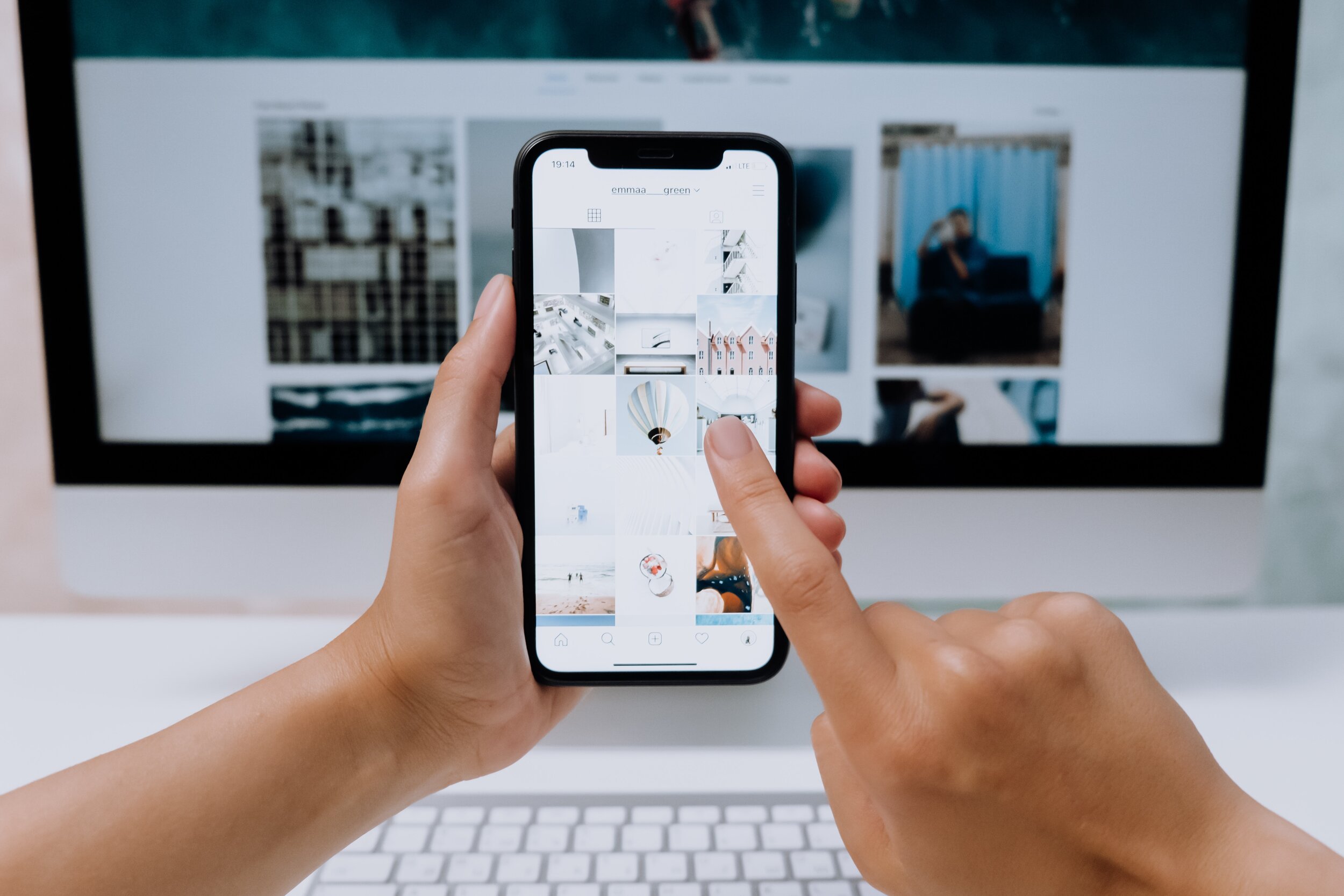
2. Your website is not optimised for mobile
Given that over 70% of people now prefer to view websites on their mobile devices and tablets, it’s now more important than ever to design your site specifically for mobile. In fact, 57% of users have said they wouldn’t recommend a business with a poorly designed mobile site (2).
A mobile friendly site should be coded and sized for easy navigation and interaction. Text should be easy to read without squinting, buttons and links should be large enough to tap with a finger, and important information such as contact details, products, and services, should be easy to find. Website speed is key, particularly for mobile users, so it’s recommended that you compress images, files, and videos found on your site.
57% of users have said they wouldn’t recommend a business with a poorly designed mobile site
3. Your website content is poor
Strong messaging and quality content and writing gives users a reason to buy from you. The reality is, content that exhibits poor spelling and grammar, or fails to provide correct contact information, leaves users questioning how much effort and care you would put into them as a customer. Your content should be clear, concise, and relate to your audience on a personal level.
When thinking about how to communicate your message to your audience, it’s important to avoid complex jargon, and think about who it is you are speaking to. Great copy should be written in such a way to persuade the reader to feel something and become compelled to act on that feeling. Your messaging should be used thoughtfully and carefully to generate the right message, and response.
And given that users have short attention spans, make their job easier by using headings, sub headings, and clear call-to-actions to highlight the information they may be looking for. Buttons and call-to-actions which are placed strategically throughout your site will enhance conversions and avoid visitor frustrations.
4. Your website appears unsecure and untrustworthy
Since 2018, Google has been labelling secure websites with a lock image beside the site’s URL. Data and information submitted on a website which uses HTTPS keeps personal information safe, and reduces the risk of a cyber attack. Unsecure websites are ranked lower on Google, and most visitors are wary of using them. Your visitors should feel comfortable using your website, sharing personal information, or making payments. Chances are, if your customer had to make a decision between two identical websites, one which was secure, and the other with a “not secure” warning, they would choose the secure website each and every time.
If your customer fills out a form on an unsecure website, there is danger that their information could be intercepted by a third party. On a secure website, the code is encrypted so sensitive information cannot be traced, leaving your customers protected.

Your visitors should feel comfortable using your website, sharing personal information, or making payments
5. Your website contains obstructive pop ups and ads
While pop up forms have been shown to convert, they can be frustrating for a website user to deal with, and can leave them having a poor experience. In the case of mobile site pop ups, this can be even more detrimental, as the close buttons are often hard to find or are obliterated by the screen. Studies show that over 73% of users disapprove of pop ups (3). And the same goes for website ads.
If you choose to keep pop ups on your website, it is recommended that you choose a hover or lightbox style. They provide a better experience for the user, without obstructing their page view. When it comes to displaying ads on your site, they should be relevant to your audience, be kept to the sides or bottom of your webpage, and shown off in a way which doesn't leave users feeling frustrated.
If you ultimately decide to continue using ads or pop ups on your website, first consider if they are worth sacrificing the user experience of your customers.
There is a lot that can be said for a well designed, well functioning website which drives its users to click “contact us” or “add to cart”. With the help of a website developer, you can create a site which puts its users first, ensuring they spend time on your site, and come back again and again.
We are here to help.
Our team at GippsTech can help you to make these improvements to your website with the help of our designers, developers, brand strategists, and copywriters.
Book in for a free consultation today!
References:
Jennifer Pepper, December 10, 2018, “7 page speed stats every marketer should know”, Unbounce
November 21, 2018, “Mobile friendly website design: the only guide you’ll ever need”, Blue Corona
Jennifer Shore, January 27, 2020, “Do pop up ads actually work?”, Smart Bug Media
June 29, 2020, “Finding the right balance between ads and user experience”, Automated
Hosting Tribunal, “20+ website load time statistics and facts, Hosting Tribunal